Tuesday 25 December 2012

'Twas the night before Christmas

We had a lovely Christmas Eve, including an outing to pick our own cherries; yesterday's awful 40C heat having given way to a lovely day in the mid 20s. After dinner James and Eleanor excitedly hung their stockings.


It's now very early on Christmas Day; Father Christmas has been (leaving behind a sprinkling of magic dust) and it's time for me to go to bed.


Merry Christmas to all and to all a good night!

Monday 24 December 2012

Brilliance

My next quilt to be included as a pattern in Australian Patchwork & Quilting is brilliance, which is in Vol 22 No 2. I got an advance copy when they returned my quilt recently, but I believe it should be available sometime in January.


I've been really keen to share this one, as I really like the way it turned out. It's much easier than it looks - I designed the piecing so there are no y-seams, and the precision comes easily thanks to the foundation-piecing (of course!). I called the block 'Brilliant' - after a brilliant-cut diamond. This quilt makes me think of sapphires, emeralds, rubies and diamonds - which is why I added to its sparkle by incorporating the silver thread in the quilting.


I quilted in the ditch in and around each of the nine stars using mostly Superior Glitter - a ribbon-like holographic thread which is beautiful to quilt with and sparkles brilliantly.


I then added extra, extra sparkle with these diamond-inspired motifs using the same thread. I marked some guidelines by eye, and quilted the whole lot free-hand.


I quilted the swirls all over the background, including the pale pink border - it makes the border really subtle.


I love the way the swirly quilting design fits into these spaces:


Looking at it now, I'm really not sure what thread I used for the swirls. It is fine with the teeniest sheen and blends really nicely (it looks pink on the pink areas and yellow on the yellow areas) so my best guess is it's a creamy-coloured BottomLine.


The only difficulty was a bit of bulk at the corners where the blocks meet; luckily it's really easy on the 820 to raise the foot higher when I need to, to get over these areas, then go back to the previous height.


For the label I used a photograph of my own wedding, engagement and eternity rings sitting on a white quilt - it seemed appropriate.

Preparing for Christmas

I've been on leave for a week already, and have been getting ready for Christmas with James and Eleanor.


We visited Father Christmas a couple of weeks ago (although I only just managed to find out what Eleanor asked for - knickers for her teddy (?!?!) which necessitated modification of several pairs of girls' knickers)! I bought 2 packs of 3 (one to modify, one so Eleanor has some that match) and basically cut the back off, and with just 2 seams sewed the sides of the front together, then the other cut edge to that. I hope she'll be happy to find them in her stocking!

(Matching pairs top and bottom showing front and back,
centre pair cut apart ready to sew (the back gets discarded))

Then last week we went to visit the Magic Cave:


While we were in Rundle Mall, we found the special letter box to post their letters to Father Christmas:


Which was right next to the  big carousel:


And then we stopped at the fountain:


And the Mall's Balls:


but it was a hot day and the bronze pigs were too hot to touch!

Sunday 23 December 2012

Swooning again

I'm quilting my third swoon quilt now; this one is simpler because it's smaller again (four full-size blocks) but it's still getting custom treatment. It's probably just as well it's relatively small, given the vast amount of pebbling I seem to have worked into the quilting design! I hadn't really intended to start on this before Christmas, but haven't been able to help myself!


I've only worked on one of the blocks so far, and am really happy with the way it's coming along. Marking so many curves has convinced me I need to get myself some acrylic curves. I'd considered getting a couple of sets in different sizes at AMQF, but not being a longarmer, I won't be able to use the rulers in the same way; for me they'll just be marking tools. But it will be much easier to have a selection of suitable curves to work with. For this quilt I needed a large-radius curve - but I was rather limited for choice among general household items, as even my largest platters weren't large enough. The one I found is a glass table topper (about 22in across), which is more than a little unwieldy, especially when most of the time I only need a short length! I did actually make myself a small template using template plastic, but I think proper acrylic rulers with guidelines etc. will be better - and of course give me more choice.


There's still some more to add to this block before moving onto the next one; some feathering on the outside of the curved pebbled lines on the tan shapes.

(from the back)

I hadn't planned to fill the inside space on the tan shapes, but it's looking as though it will need something; probably a small shape echoing the curved lines filled with pebbling.

Saturday 22 December 2012

Set-up for quilt photographs...

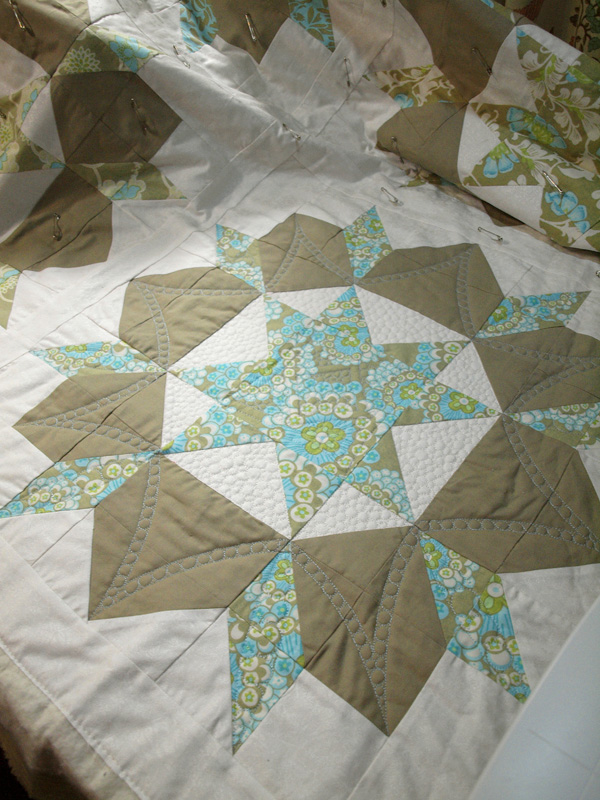
...and finished photos of this detailed custom quilting job I've just finished; a six-block Swoon, quilting with coordinating pink, aqua and white Glide thread.


(Apologies if this post seems a bit scatty; I initially had it as part of the previous post, but it got so long I split it in two a while back, and this part doesn't flow as nicely now - but the gist is still there.)

For progress photos of my quilts, I'll happily take fairly quick snaps, though as I mentioned, I do correct them a little before blogging them! But I like to have good quality photos of the finished product. That means I want the quilt flat and square, in focus, well lit to show the quilting, and to have accurate colours. Generally I have achieved most of this to a certain degree by sticking my quilts to an outside wall with lots of double-sided tape.
 
 
If I time it just right, I get good, indirect natural light. But with bigger quilts, I often get shadows at the top from the verandah, and the really big ones don't fit - there's no one section of flat, uninterrupted wall space big enough for a king size quilt where I can also stand far enough back not to distort the photo, and have decent light.

 
But even assuming the quilt fits and the time and weather cooperate, taping the quilts up is tedious, uses lots of tape (it's not cheap) and it's hard to get them square. I'm getting better with practice, but it's really hard to keep the edges straight and squared, and even the most perfectly square quilt usually gets tugged out of shape. I did try using a spirit level and taping some reference lines to the wall, but they didn't last and were often not in the right place for the different sizes and shapes of my quilts - and it's too time-consuming to do every time. I photograph quilts quite often!
 
 
The main reason I went and bought myself the large foam sheets was for photographing my quilts, rather than designing them. My ultimate aim is to have 2 or more covered foam sheets, with marked grids. The cheap foam is easily damaged without covering, but to do it properly will take some thinking and time - not always available when I need to get photographs of a finished quilt. For now, I've reinforced the edges of the sheets with wide masking tape, and used my quilting rulers and a felt-tip pen to mark some grid lines.
 
 
The Wave quilt aside, this customer quilt was the first one photographed properly in this manner. It's wider than a single sheet of the foam (1200 x 2450mm, approx 4 x 8 feet) , so I taped 2 together with gaffer tape along the long edge.


This was rather interesting. I did it in our hallway, but found myself stuck. The hallway is about 10cm (4in) too narrow to fold the second sheet back to the first one, and the doorways at either end definitely too low to allow passage of the opened pair! Very heavy furniture also blocked one end. With help from James and Eleanor, we just managed to fold the two enough to get through the doorway into my bedroom, and by shoving our bed along, just squeezed the pair right into the room enough to fold them together, then tip them onto their side and carry them out!
 
 
I still need to work out a good spot to both store the large sheets without damaging them, and for pinning the quilts, then photographing them. Pinning is best done flat on the floor; where the weight of the quilt isn't an issue. But you need to be able to reach the edges easily to align them with the grid lines and pin (leaning on the foam leaves indentations, even if you're careful), and you need space to move! I forget just how many pins I used now, but they were spaced about every 3in around the edges, and there were six strategically-placed in the centre. I use fine pins with tiny heads, so they neither leave holes nor show in the photo.
 
 
This time I photographed the quilt in our enormous barn-like carport. My 'usual' wall doesn't have enough clearance for such large sheets (2.4m high) and I don't want to cut them, as I'll need the height for the bigger quilts (in fact, they're still not quite large enough for a king size - I'll deal with that issue when I get to it!). It's not ideal, but it worked well enough - once I'd manoeuvred the boats and trailer out the way.


The shadowing (top left)  is the main issue (maybe I'll replace more of the metal roofing sections) but I need the support of a wall to keep the whole lot flat. (In fact, even leaning close to the wall, I had to get James and Eleanor to stand on either side and gently push back the sheets part-way up to prevent the centre bagging out).


And then again after the photo shoot, I edit the photos. I've been doing that tonight while listening to/watching Carols by Candlelight.


I'm now working on another swoon quilt for the same cusotmer, but this time with only four blocks. Progress photos coming...

Friday 21 December 2012

Taking and editing quilt photographs

I almost always edit my photos before sharing them; whether here, on Flickr, facebook, or just emailing them to friends and family. Although I work to take good photos, some simple editing helps to show things in their best light (literally!) and can make them more true to life. I generally use the editing to correct colours, fix the light levels, and sometimes sharpen the image a bit, so that what you see is as accurate as possible.

(Crowing - before editing)

I have a good, but not especially fancy camera - it's an Olympus e620 (a DSLR). I upgraded nearly 2 years ago because my old camera could never photograph a quilt well - it simply couldn't focus accurately both in the centre and at the binding. It drove me batty. So my choice camera was largely driven by my desire to fix that. I'd fully expected to come home with another Canon, or maybe Nikon, but the quality of Olympus lenses, combined with some other technical stuff I've long forgotten easily swayed me. And I confess I mostly use it on the auto/part auto settings.

(Crowing - cropped, black/white levels adjusted, image sharpened, colours brightened/corrected)

The various programs I've been using to edit photos (an old version of Photoshop, Microsoft Office Picture manager and Paint - sometimes all 3 on one photo!) have helped combat most of the issues with lighting, colour, focus and even some distortion, but I still wasn't quite happy.

(Waving - before editing)

A while back, Photoshop refused to open on my old computer, so I started looking around, and downloaded a 30-day trial of the new version of Photshop Elements (11). I've been playing with it. I have to remember some differences between the versions (and I was never an expert; I've really just figured out a few things with a little assistance and trial-and-error, and know I've not touched the sides of what the software is capable of) but already I've discovered what appear to be new features, such as being able to adjust for perspective. And I've found ways of doing most of the things I used to use. My trial is about to end, and I know I have no option now but to bite the bullet and buy the software!

(Waving - cropped, colours corrected and brightened, image sharpened, black/white levels adjusted, image straightened)

The examples shown are photos of 2 of my own quilts, before and after I edited them. The changes are nothing drastic, but the end result is much better, and much more accurate.

By the way, I have no affiliation with any of the companies or products mentioned, and get nothing for this post, I'm just sharing my thoughts.

Waving

I made the decision a while back that I would make quilts for James and Eleanor's first school teachers (assuming I felt it warranted) but after that it would have to stop. James was lucky to have a wonderful teacher last year, and we made her a quilt. Eleanor has also had a terrific teacher to start off her schooling this year, and I knew she needed something special as well.


I decided very close to the end of the school year that I wasn't satisfied with the quilt I'd been working on, and started this one. It incorporates her teacher's two favourite colours - tangerine and turquoise, and we already knew she loves the beach. Fortunately, she also seemed to love the quilt when we gave it to her on the last day! Not only is she an artist herself, but her mother happens to quilt, so she really appreciated the time and skill involved.


One of the comments I received after blogging the first stage of the quilt was that a white background/sky would allow the wave to stand out best - but unfortunately I was already well on the way to piecing the sky from a range of sky prints by that stage. Because the reader was right. Although the colours contrast better in person, the wave does tend to blend into the sky. With the benefit of hindsight, I'd've used a solid sky-blue. Oh, well!


I struggled to find a full gradient of fabrics for the sun, and ended up using my new-found love of fabric painting to get the last 2 colours right. Unfortunately I left the lighter one too light, but it's still better than the original, so I'm on the right track.


I quilted feathers over the break of the wave to accentuate it a little, then filled the background with my current favourite - swirls. I used several shades of tangerine and yellow over the sun to help blend the shades further and a soft grey on the sky in the hope that would further differentiate the sky form the wave. I think it helped.


The wave was quilted in sets of wavy lines, into which I managed to work a change of direction to make the lines flow with the wave. I had originally planned to fill the gaps between the wavy lines, but in the end I felt leaving them empty created better effect, and created better distinction between wave and sky. I used about 4 different shades of turquoise (tending towards green, again for better differentiation) on the wave to blend with the fabrics.

This was the first quilt I photographed using the foam boards. While this was done very quickly (I hadn't yet marked even a large grid to help keep it square) it worked well, although I do need to work out the best location to use them. Pinning the quilt to the boards is tricky when more than one board is involved, and it's no faster than thedouble-sided tape, but there's no wastage - the pins and boards are ready to use again next time.


Sunday 16 December 2012

Thread changes

It occurred to me tonight why it's taking so long to quilt this swoon quilt; it's all the thread changes! My brief included combining pink and aqua threads on the white background. Which is all very well, and looks lovely, but...

 
Most of the custom quilting needs a certain amount of marking. Much of it is just guidelines (mostly circles traced around various items) but some of it needs to be fully drawn out. I've come to trust and rely on my Sewline purple marker for this; it goes on quickly and easily, is nice and clear, and vanishes totally. But it fades very quickly, which means I have to mark small sections as a time, them quilt them straight away. And most times that means several thread changes for every time I mark, although I am leaving a lot of the white to go back and fill-on later. I'm about 16 hours and maybe 30 thread-changes in!


Today I finished the mirrored pairs of tiaras connecting the sides of the swoon stars (above). All together, they create an effective pattern around the main motif (below). Speaking of which, the main motif makes me think of a spirograph. I've filled around this one with McTavishing, but will wait and do the other next time the machine is threaded with white.


Tonight I've moved onto the border space. I've done 2 of these large semi-circles and have another 2 to go on the other side:

Friday 14 December 2012

Loopy

Now that the wave quilt is complete (photos soon), I can focus all my attention on completing the quilting on the mermaid swoon quilt. Between stages of the wave quilt I finished quilting the main part of each of the 6 blocks, and now I'm onto the background, including the sashing. I'm treating the lot as a single area (they're all done in the same white fabric), and then breaking it up with the quilting.


At the two intersections of four blocks I'm putting this large, circular motif (shown from the back). I used a selection of crockery, glassware and other items to mark the circles and the spacing for the loops and swags, then drew them in free-hand wth the vanishing marker before quilting them in a combination of pink and aqua.


I'm putting mirrored pairs of these tiara-inspired arcs between the blocks. I'm hoping to get them all done tomorrow, and move onto the border area by evening.